The curious room of heterotopias:

The trip to the

The bridge:
The bridge of the
Also, the bridge is an interesting space because it behaves as no man’s land. It is not a line (that always creates the other) it is a space of the in-between. Things that cannot enter either of the two countries can find their space here.
The Design: 
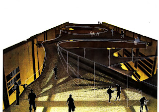
My design suggests the use of these bridges as a space for display and sale of things confiscated by the border patrols. It’s a place where seized apples can be eaten and residual watermelons be sold. It’s a market that changes its products everyday according to what is sequestered at the port of entries.
I propose it to be the space for the heterotopias that can sell books and show movies that are censored by either one or both the counties.
It is also a place where people can meet their loved ones who live across the border and not have to touch them through meshed fences.
The design creates space in-between the bridges that run from US to
The edges act as buffer walls from the traffic yet are porous enough to give glimpses of the suspended meshed structure contained within it. The contained space can be populated by programs of sale and commerce as mentioned above. The thick edges also serve as spaces to store the things being sold. As every item sold here would have a story of exclusion in some ways the shelves would come to store stories of heterotopias.
The form took its cue from a previous border mapping exercises where I represented the stories of the wikimap as connectors in the virtual space - that at help personalize space. As De Certeau puts it. "They carry out the labor of transforming spaces into places and places into spaces. The model that represented this is shown along side where parts of
The process of design made formal explorations into various ways in which the space could be moulded using fabrics that stretched across margins. The final space culminated as a series of platforms that flowed into each other creating smooth space geometry.
Conclusion : The creation of the border wall is an expensive yet futile attempt to curb problems of a much larger magnitude. It is a reaction to the symptoms and does not deal with the actual socio-economic- political reasons that are causing the exodus. The reaction reeks of hostility. My project intends to use the bridge as a space of release in this environment. It is a program that I believe can be replicated over various ports of entry into the country. Like many other projects in the studio, it seeks to puncture the antagonistic attitude that plague the space today. It attempts to make the space of the bridge a space for encounters and meeting rather than a sterile space for crossing over.


1 comment:
Having explicitly accepted the bridge as a heterotopia, I believe you even critique the very excercise of 'designing' the (humane) wall very well by insinuating that the excercise attempts to MAKE you design the Foucault's Garden within a city! that exists only so that the city continues buisness as usual but provides intervals of relief to whoever needs it (?) But the wall/city/boundaries are a given that your profession accepts and works around...when does the scope of design stop exactly? or can you work around most conditions of marginalization, migration, polarization, poverty etc through DESIGN?
Post a Comment